Supporting Content: When You Design for the Edges, You Design for Everyone
By Nathan Stoker · November 1, 2026 · 5 min read

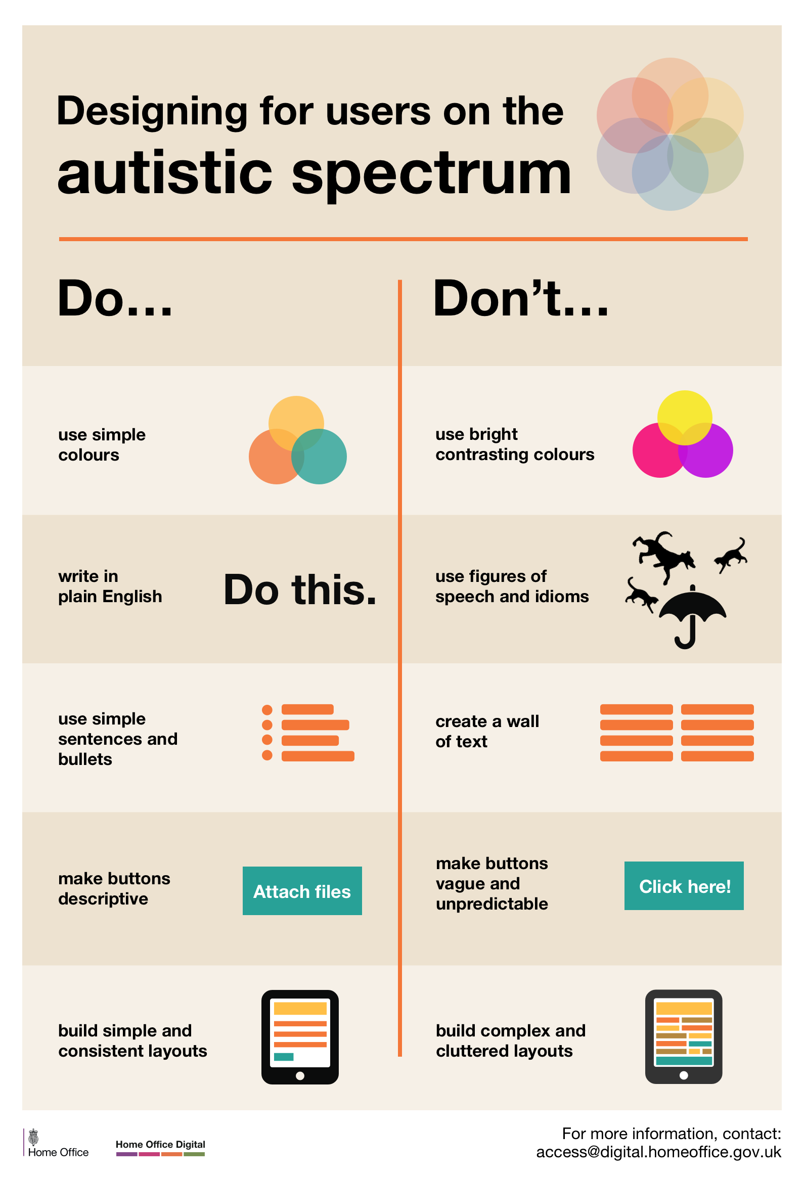
When You Design for the Edges, You Design for Everyone
There's a poster from the UK Home Office Digital team that's been making the rounds in accessibility circles for years now. It's deceptively simple: a two-column list of do's and don'ts for designing digital experiences for users on the autistic spectrum.
Use simple colors. Write in plain English. Make buttons descriptive. Build consistent layouts.
Nothing revolutionary, right? And that's exactly the point.
The Curb Cut Effect
In the 1970s, disability advocates fought for curb cuts—those small ramps where sidewalks meet streets. The original intent was to help wheelchair users navigate cities independently. But something interesting happened: everyone started using them. Parents with strollers. Delivery workers with hand trucks. Travelers with rolling luggage. Runners. Cyclists. People carrying heavy loads.
This phenomenon became known as the "curb cut effect"—when accommodations designed for people with disabilities end up benefiting everyone.
The same principle applies to digital design.
Breaking Down the Guidelines
Let's look at each recommendation from that Home Office poster and consider who actually benefits.
Simple colors instead of bright, contrasting colors. Yes, this reduces visual overwhelm for autistic users. It also reduces eye strain for everyone staring at screens for eight hours a day. It creates a calmer, more professional aesthetic. It makes your content easier to focus on.
Plain English instead of figures of speech and idioms. This helps autistic users who may interpret language literally. But it also helps non-native English speakers, people reading quickly on mobile devices, anyone scanning for information, and frankly—anyone who's ever been confused by corporate jargon. "Let's circle back on that deliverable" helps no one.
Simple sentences and bullets instead of walls of text. Autistic users often process information differently and can be overwhelmed by dense paragraphs. So can tired parents. Busy executives. Students studying at midnight. Literally anyone trying to extract information quickly.
Descriptive buttons instead of vague "Click here!" links. "Attach files" tells you exactly what will happen. "Click here!" tells you nothing and is terrible for screen reader users, but it's also just worse for everyone trying to navigate a page efficiently.
Simple, consistent layouts instead of complex, cluttered ones. Predictability reduces cognitive load for autistic users. It also reduces cognitive load for everyone else. We've all landed on websites that feel like visual chaos and immediately bounced.
The Hidden Assumption
There's an uncomfortable assumption baked into how we often think about accessibility: that "normal" users have infinite patience, perfect focus, unlimited cognitive bandwidth, and no stress. That accessibility features are accommodations we make for edge cases.
But who actually experiences the web that way?
Not the parent trying to complete a form while a toddler demands attention. Not the employee multitasking between twelve browser tabs. Not the commuter glancing at their phone between subway stops. Not anyone, really, on their worst day.
When we design for autistic users, we're designing for people who need clarity, consistency, and reduced cognitive load. When we remove that design, we're assuming everyone else doesn't need those things.
They do. We all do.
Inclusive Design Is Just Good Design
The guidelines in that poster aren't accessibility accommodations that make designs "worse" for neurotypical users. They're principles that make designs better for everyone while being essential for some.
This is the shift that needs to happen in how we think about accessibility. It's not about compliance checkboxes or edge cases. It's about recognizing that humans are humans. We all have limited attention, varying stress levels, different reading speeds, and days when our brains just aren't cooperating.
The user on the autistic spectrum and the neurotypical user who's exhausted and distracted have more in common than we often admit.
A Challenge
Next time you're designing something—a slide deck, a form, a website, a document—try applying these principles. Not as accessibility requirements, but as design principles. Ask yourself:
Is this as simple as it could be?
Would someone unfamiliar with our jargon understand this?
Does every button tell you what it does?
Is the layout predictable?
You'll probably find that the result is better for everyone who uses it.
Because when you design for the edges, you're not compromising for the majority. You're discovering what good design actually looks like.
The poster referenced in this article is from the UK Home Office Digital team's accessibility resources. Their full set of posters covering various accessibility needs is available online and worth exploring.