In a previous post I showed how you can apply animation styles to your next button to help alert the learner that it’s time to move on. I got to thinking, what else can we update.
Do you remember back in 2014 having your elearning have its own player skins was all the rage. I remember creating or helping with creating custom player skins for clients and they had a blast. It was Flash based and when Flash was disconninued the ability to have your own skin was gone. Sure you could add your own colors using Articulate Storyline’s player options, but have you ever looked at Articulate Storyline’s built-in player and thought, “Meh, I wish this looked more like my course”? Customization is a big part of making engaging e-learning. While Storyline doesn’t make it super obvious, you can style that player with a bit of code magic.

A Few Things to Keep in Mind:
- We’re working with rectangles here, no fancy shapes or super complex styles.
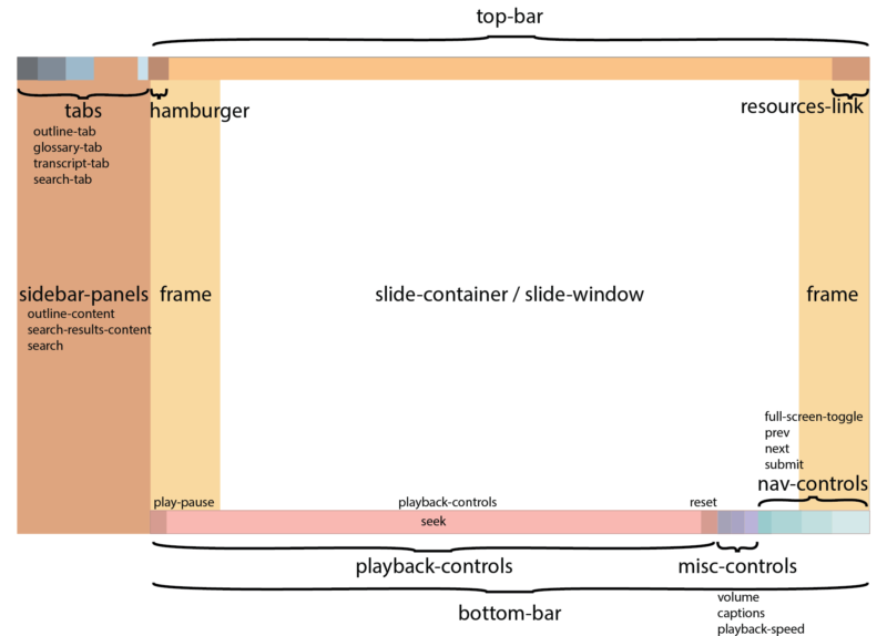
- Articulate Storyline’s structure (the Document Object Model or DOM) limits us to five main areas: top-bar, bottom-bar, sidebar-panels, tabs, and frame.
- You can skip the tabs if you don’t have a sidebar panel.
- The “frame” is the main background. If you don’t style the top or bottom bars, the frame image will show in those areas too.
- Be prepared for things to shift a bit if your learners resize their browser windows. Aim for a design that adapts well.
Here’s the Code to Get You Started:
 function applyBackgroundImage(id, imageUrl) {
    var element = document.getElementById(id);

    if (element) {
        // Apply the background image to the element
        element.style.backgroundImage = 'url("' + imageUrl + '")';
        element.style.backgroundSize = 'cover'; // Adjust as needed
        element.style.backgroundPosition = 'center'; // Adjust as needed
        element.style.backgroundRepeat = 'no-repeat'; // Ensure it doesn't repeat
        element.style.zIndex = '2'; // Set z-index because hamburger menu button was below the top-bar and this puts top-bar (and everything) below the hamburger menu div.

        console.log("Background image applied to " + id + " with z-index 2.");
    } else {
        console.error(id + " element was not found.");
    }
}

// Apply background images, rename the file names as needed.
applyBackgroundImage("top-bar", "mobile/5zldGx2agCE.png");
applyBackgroundImage("tabs", "mobile/5ZhNcksAoaH.png");
applyBackgroundImage("sidebar-panels", "mobile/6YT6kgtvjBl.png");
applyBackgroundImage("bottom-bar", "mobile/5miElQ7dCvH.png");
applyBackgroundImage("frame", "mobile/5nx5acZU3YP.png");
How It Works:
-
The Function: The code starts by defining a function called
applyBackgroundImage. This function does the heavy lifting of finding the right spot in your player, applying your image, and making sure it looks good. -
Applying Images: The lines at the end actually use the function to style your player. You’ll need to replace the placeholder image file names (
mobile/5zldGx2agCE.png, etc.) with the actual paths to your images.
How to Use It:
- Get Your Images Ready: Create your custom images for the top bar, bottom bar, sidebar, tabs, and frame, save these as png files.
- Upload to Storyline: Add your images to your Storyline project, place it in a layer that doesn’t get seen or off screen somewhere.
- Copy the code: Head to the master slide main slide and create a trigger when timeline starts running the JavaScript.
- Publish and Find Image Paths: Publish your Storyline course once to generate the image file paths. These paths are usually located in the “mobile” folder of your published output.
- Update the Code: Replace the placeholder file names in the code with the actual file paths you just found.
And that’s it. Republish and reopen, you should see your skin in action!
Please watch this video below:


